The Challenge
cinematographIC VISION
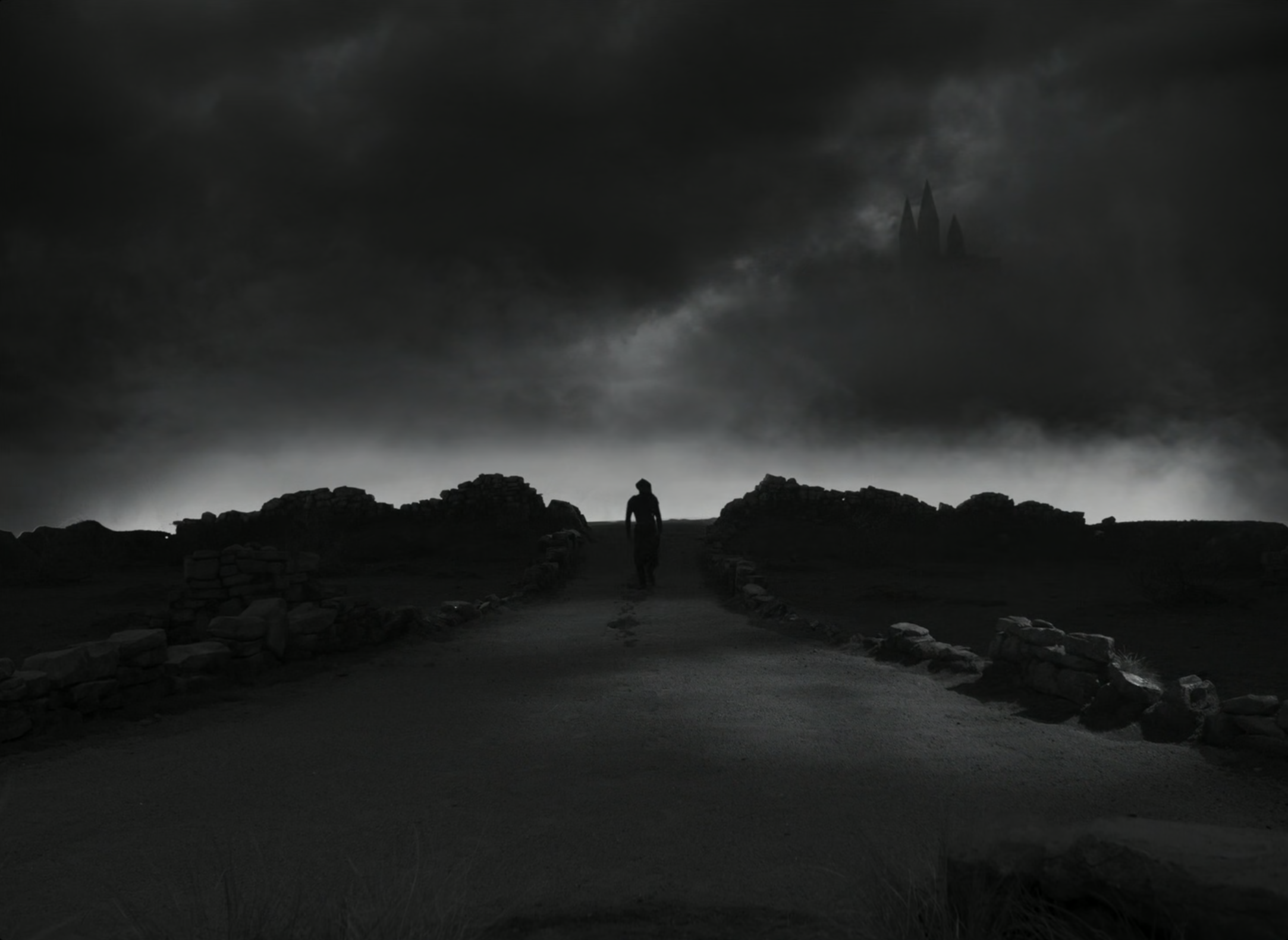
In our original conversations, cinematographer Bruno Delbonnel expressed his desire to create a high contrast, very theatrical feeling to the lighting of the film. He had compiled hundreds of visual references so his vision for the movie was very clear. It was to look very theatrical, very German expressionistic.
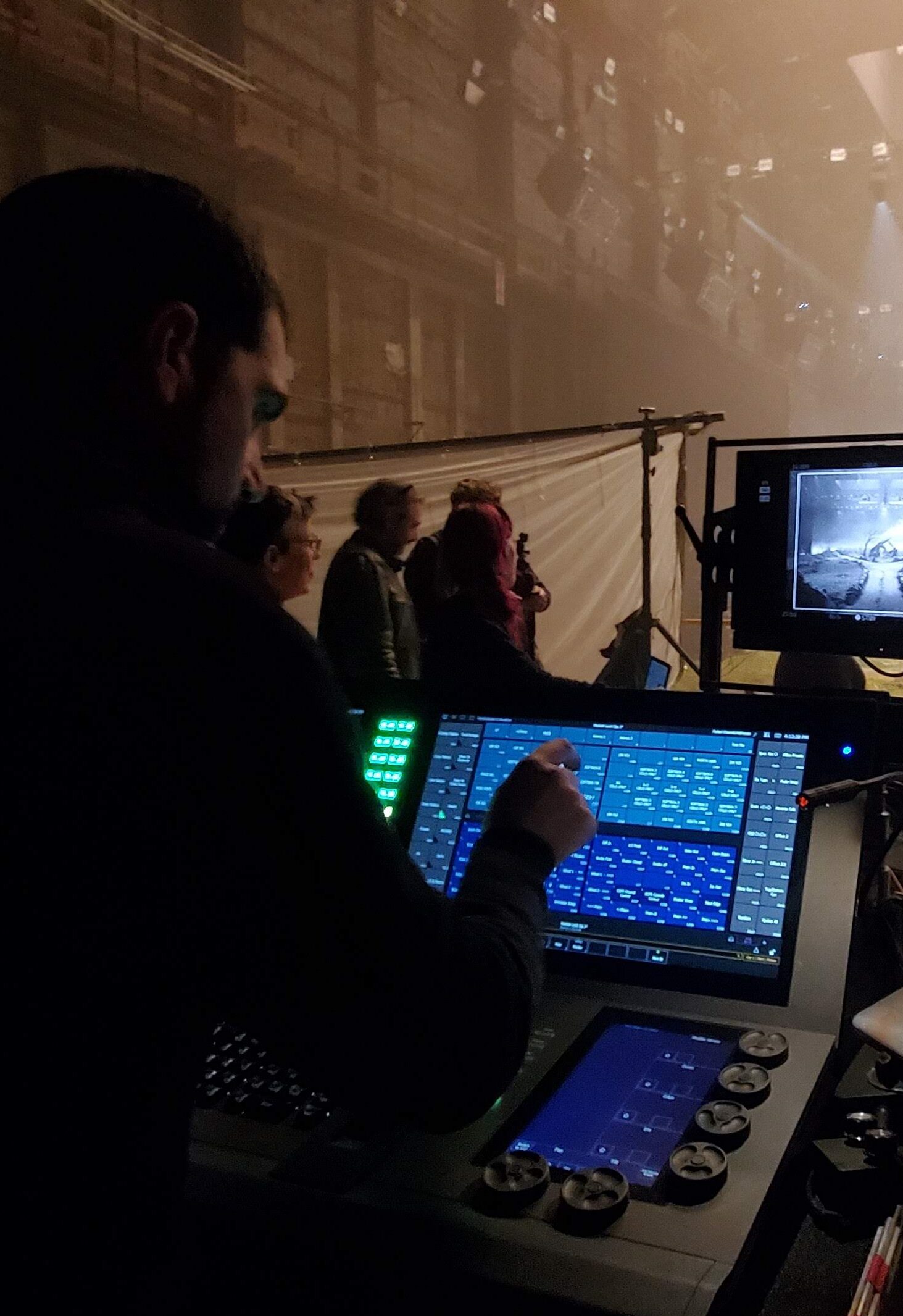
Translating the vision that was in Bruno’s head required the team to be able to do a lot of sharp cuts with the lighting to create the look and feel he wanted. After initial testing, it soon became very clear that we would not be able to do it using traditional film lighting instruments such as Fresnels and using grip flags to cut the light. The solution required looking at something outside of the normal cinema line of lighting.
...to be able to do a lot of sharp cuts with the lighting to create the look and feel...
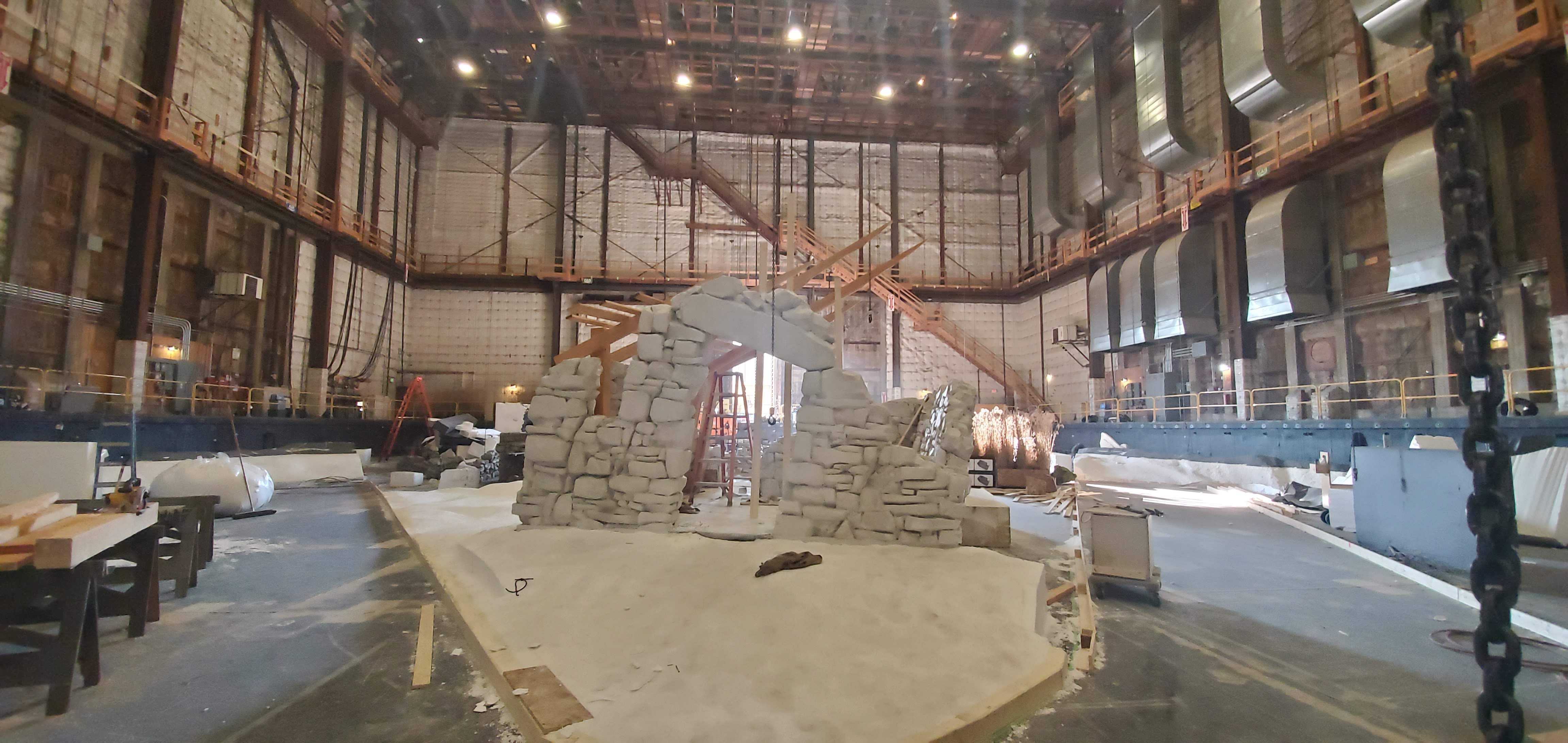
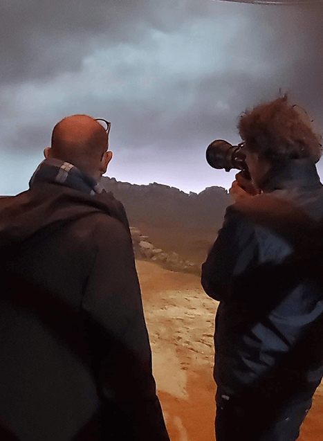
Set build with blocks of Styrofoam


The Collaboration
quick CREATiVE CHANGES
We came upon the use of automated lighting used in the live event industry and in testing, we discovered the high end system solo frame series, which was used extensively throughout the film. These tools allowed the team to create dramatic cuts, make quick creative changes, and add animation into the light because Bruno was very insistent about a moving light source. The light itself had to have a voice in the film that supported the performances of the actors.
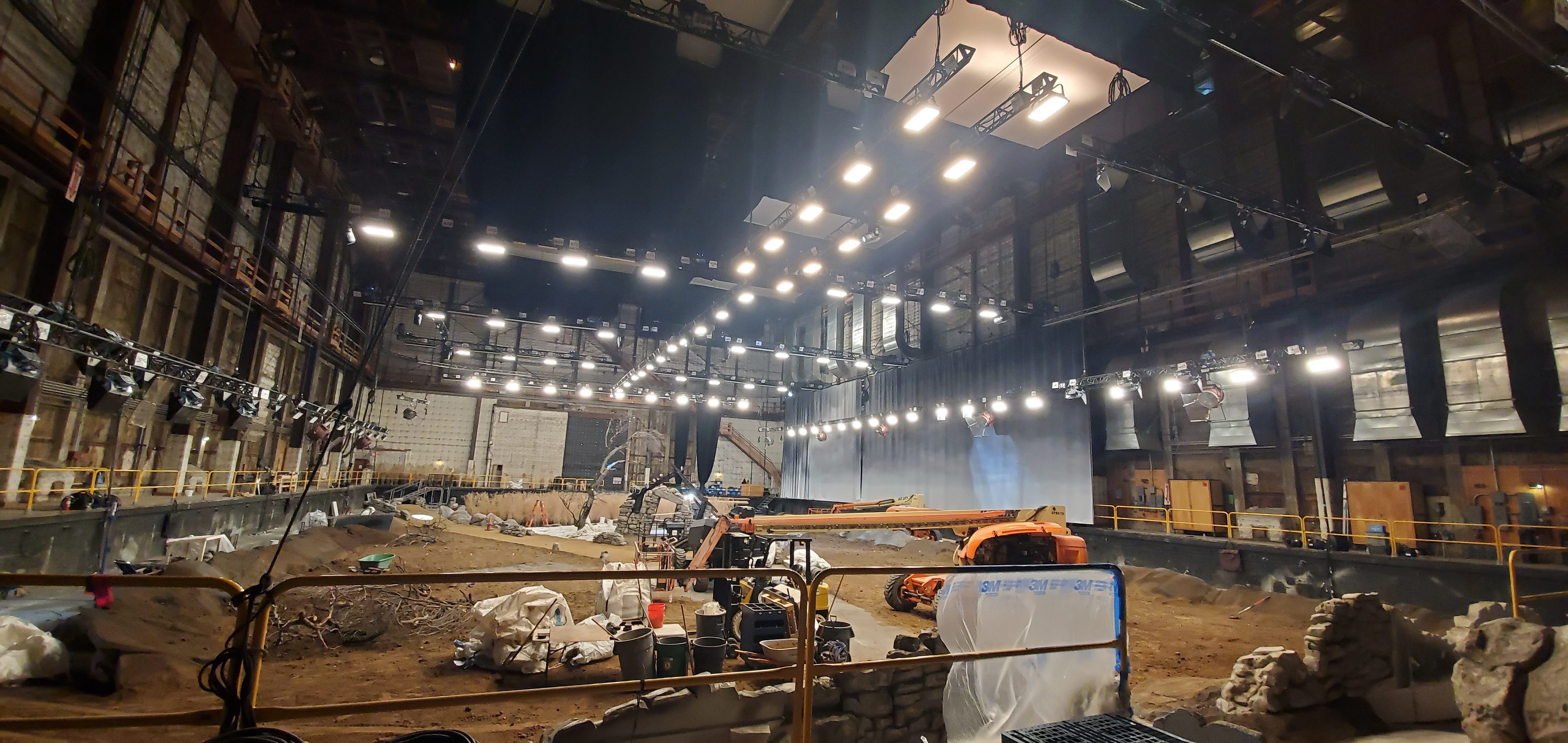
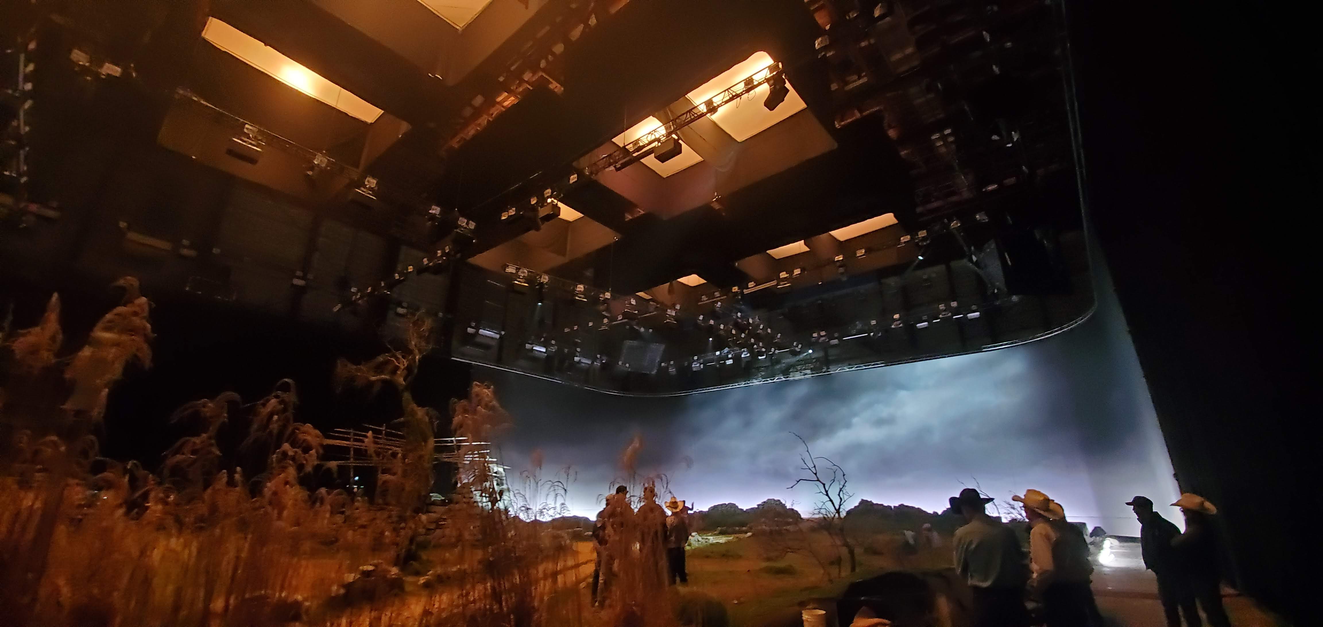
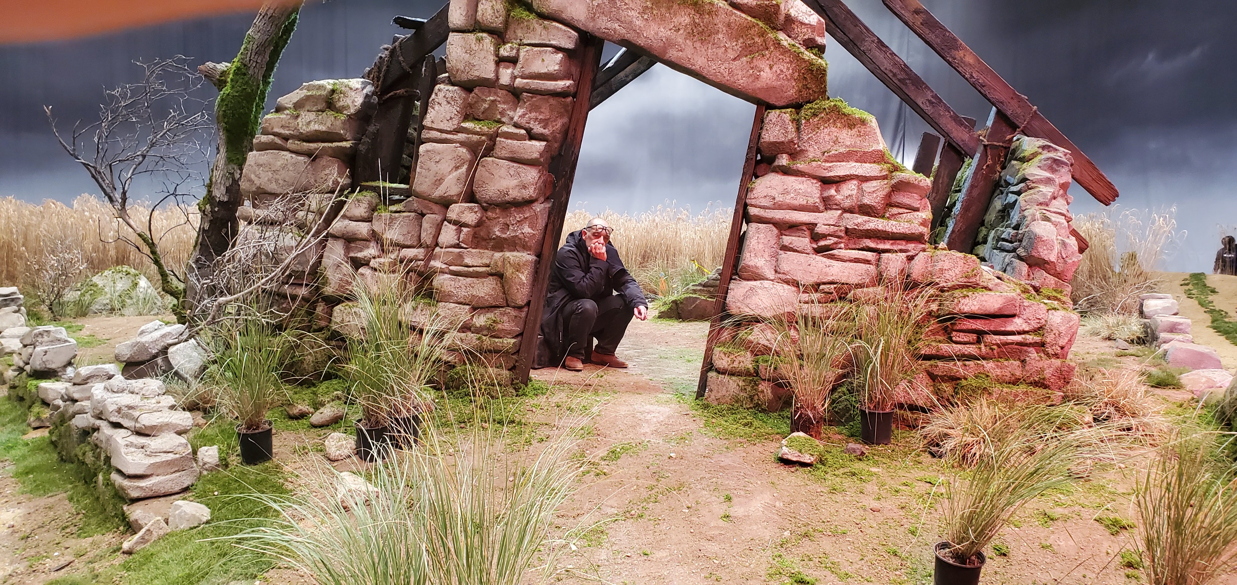
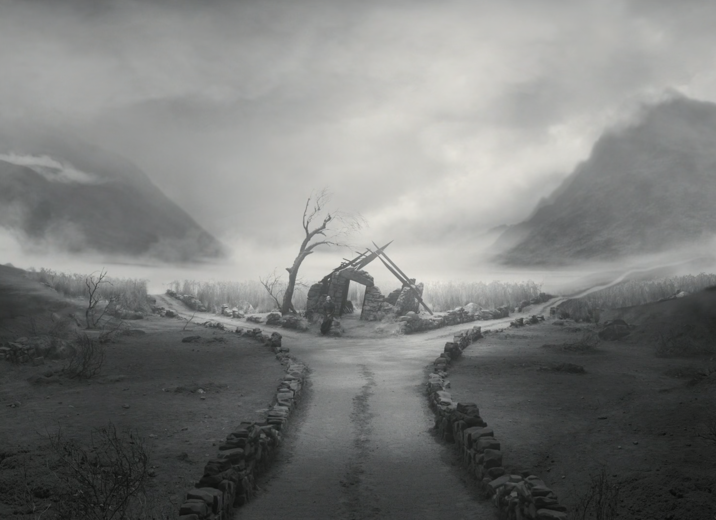
The crossroads set was built on Stage 16 at Warner Brothers in Burbank CA. It’s one of the tallest stages in the world and has been around since the 1930s. It was one of the largest sets of the film. So for the Crossroads the approach was to put a series of trusses that basically divided the stage into eight quadrants.
Each quadrant had a top light source, which was filled with incandescent 12 light Maxi brutes filled with 1000w par globes.
Surrounding the set were trusses that had a mix of sky panels around the perimeter which created soft backlight. High End Systems sola frame theaters, Solaframe 3000s andHybeams were spread throughout the rig.
To create separation in the background, some Chroma Q studioforce 72s were used to light the painted backings. Astera Titan tubes also filled in some gaps. By spreading this around, the illusion of depth was able to be created using light and shadow.
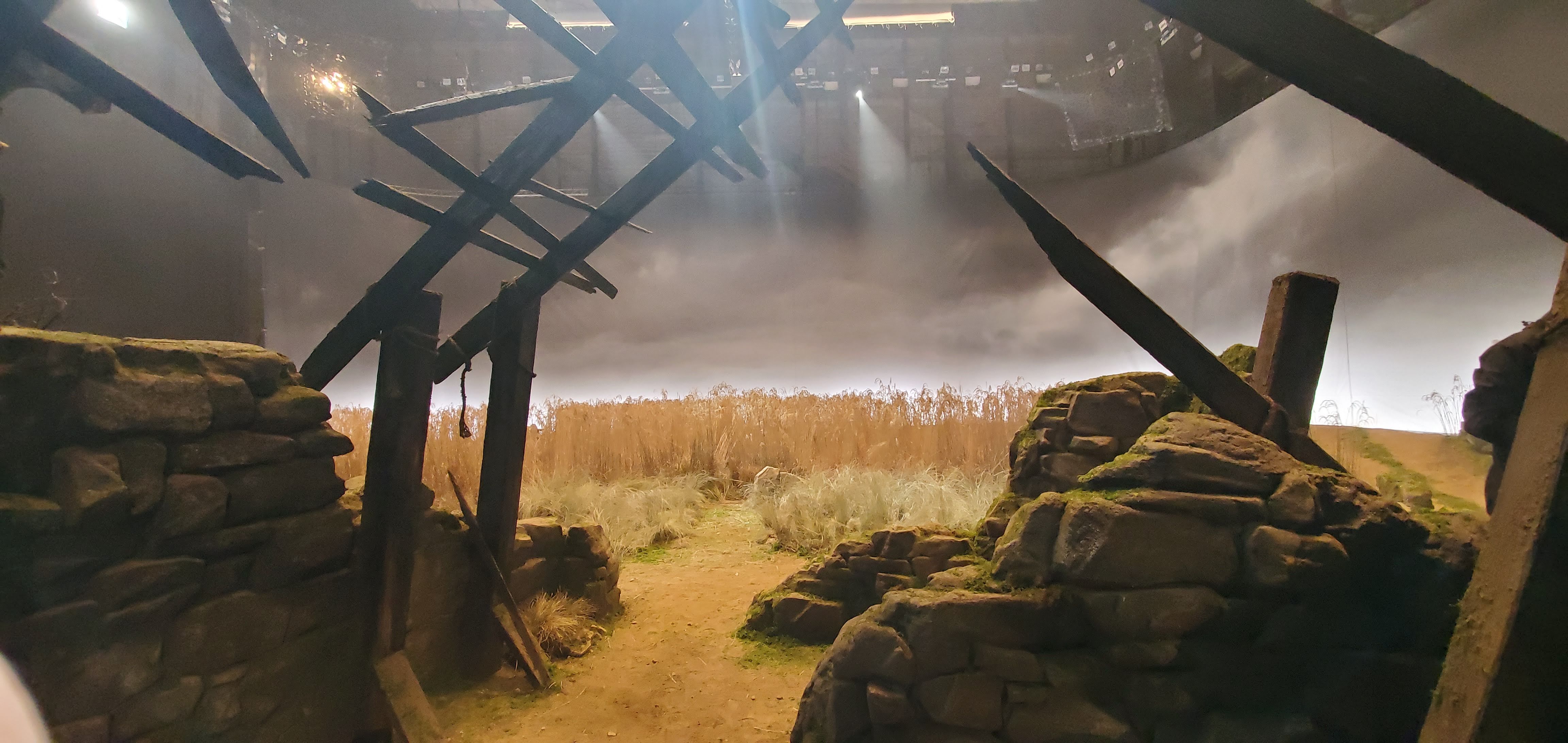
The advantage of using the Solaframes with the painted backings is creating cloud animation effects by utilizing the animation wheel. This allowed as much as possible to be captured within the camera.

The Results
GERMAN EXPRESSIONISM + CHAIROSCURO
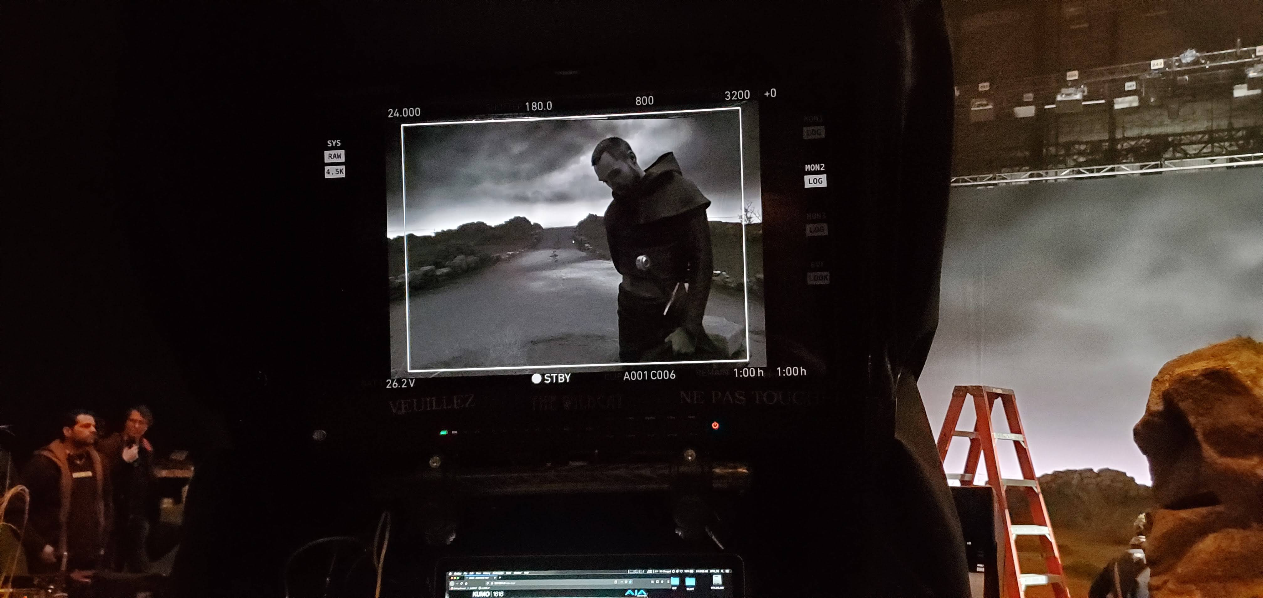
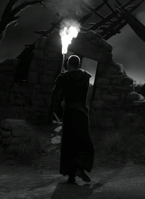
The end result achieved the very theatrical, high-contrast look of Joel Coen and Bruno Delbonnel’s original vision.
Think German expressionism, think Nosferatu, think lots of chiaroscuro. And keeping the set design very simple, like here’s two walls. Clean, sparse. And the rest done in lighting. There is no way we could’ve lit the film as well if we had been doing it with traditional lighting.
After one week on set Bruno said, “There’s no other way we could do this movie. This is fantastic.” And that’s because thanks to the High End Systems fixtures we could give him so many creative options. It really made it easy for everybody.
